❋
CASE STUDY: HYPEFILL
CASE STUDY
Visual identity system for a next-generation fulfillment platform
Hypefill is an early-stage, technology-driven fulfillment platform built to support D2C sellers through intelligent logistics and adaptable operations. The company required a distinctive and scalable visual identity capable of positioning it as a forward-thinking alternative to traditional fulfillment providers.
Entering a competitive logistics landscape, Hypefill needed a modern and recognisable brand presence that could communicate:
Technological intelligence
Adaptability and workflow efficiency
Growth and operational reliability
Accessibility for emerging and scaling businesses
The brand had to feel dynamic yet controlled — designed to scale across digital environments while maintaining clarity and precision.
🧰 My role: Independent Brand Designer (Freelance)
Led logo and identity development from concept to final delivery
Defined colour architecture and typographic system
Designed comprehensive brand guidelines documentation
Developed branded and marketing materials for digital applications
Collaborated with copywriter to align tone and visual direction
Challenge & Strategic Context
The identity was developed around the idea of intelligent progression. The logotype integrates subtle character connectivity, symbolising operational flow and the relationship between platform and seller. The form prioritises legibility and strength, ensuring clarity across digital interfaces and small-scale applications.
A high-contrast colour system reinforces technological confidence, while rounded typographic elements introduce balance and accessibility. Every decision was guided by scalability — building a system capable of evolving alongside the product.
Hypefill animated logo
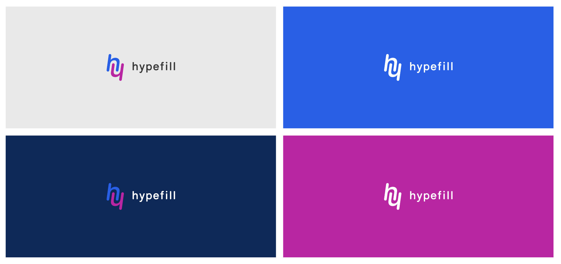
Logo application
Early exploration focused on achieving a balance between typographic strength and symbolic integration. Iterative refinements prioritised simplicity, memorability and digital adaptability — ensuring the final mark performs effectively across product interfaces and marketing applications.
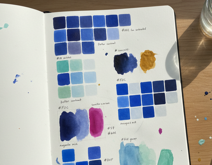
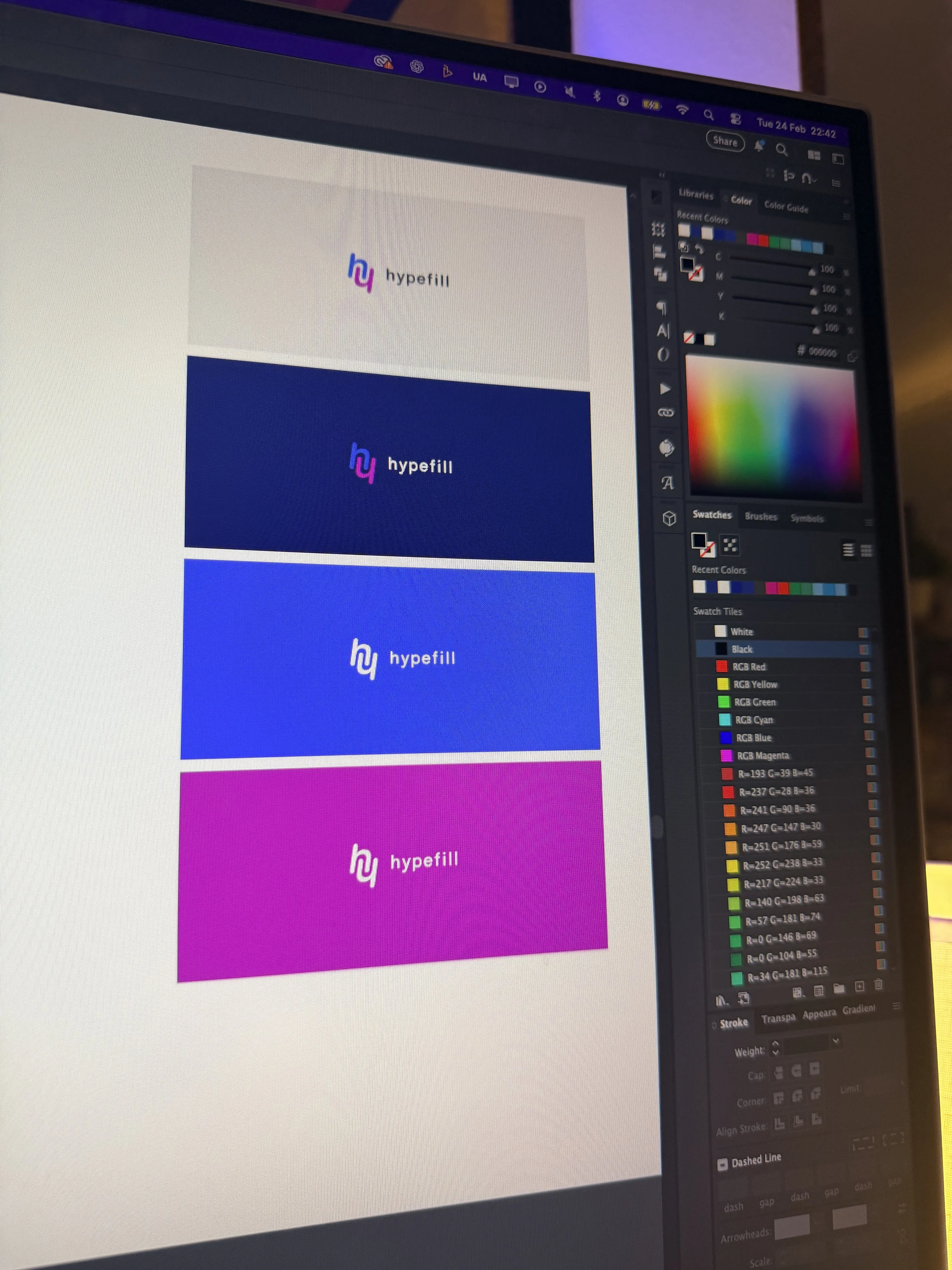
Colour experiments
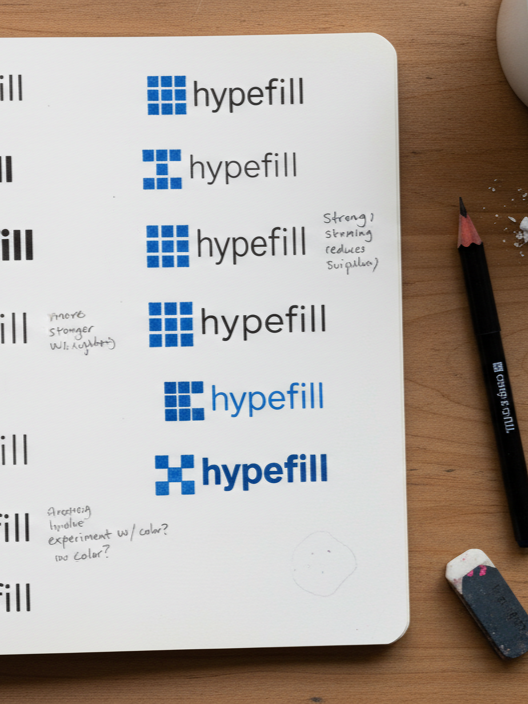
Initial ideas
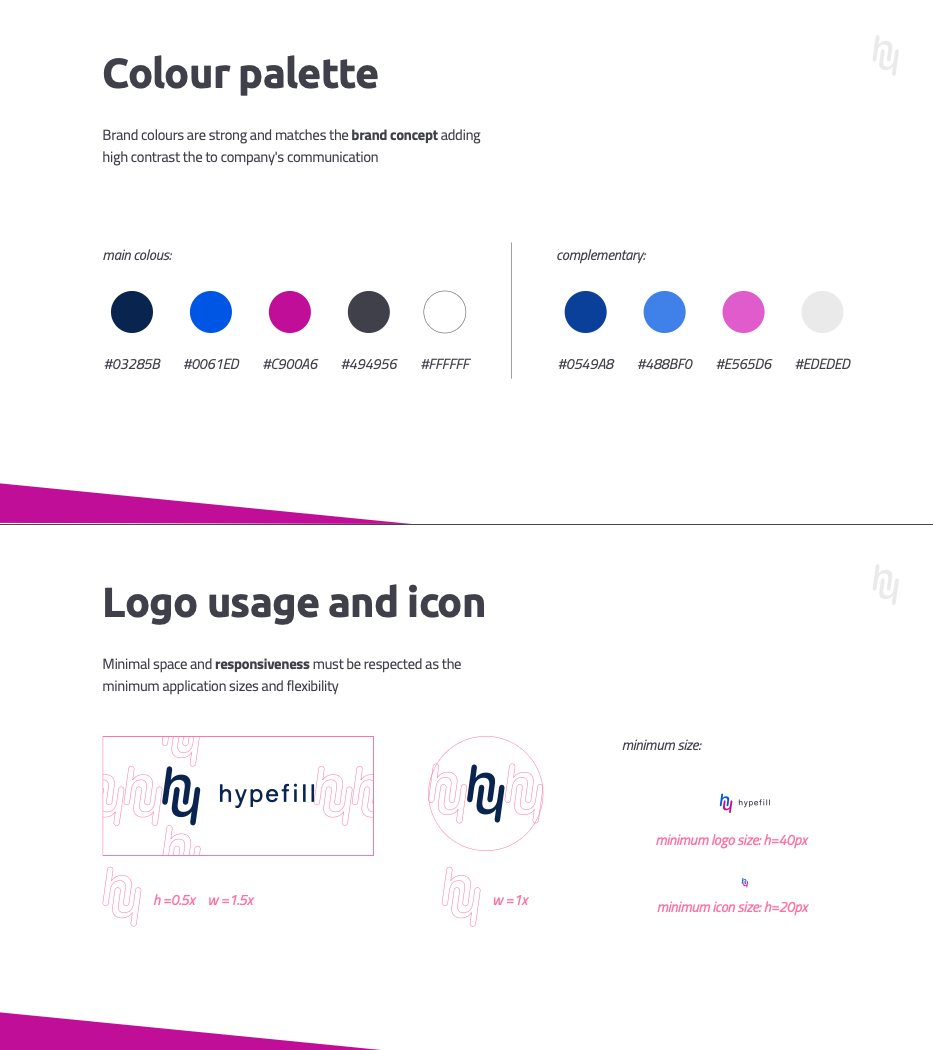
Some brand guidelines
Digital evolution
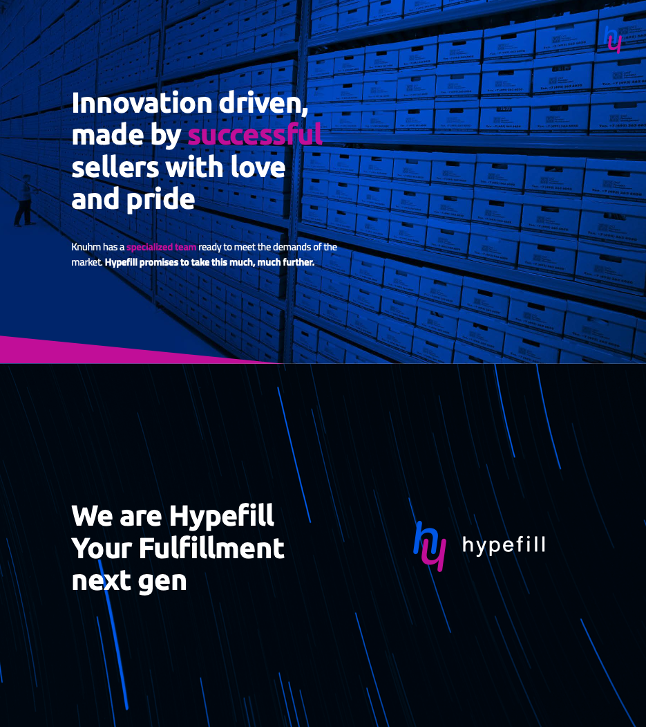
Digital and OOH asset
📈 Outcome & Impact
Delivered complete brand identity for early-stage tech venture respecting brief constrains and requirements.
Established scalable visual foundation for digital and marketing rollout
Enabled clear positioning within competitive fulfilment market
Provided structured brand documentation to support future growth
MORE CASES